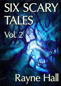
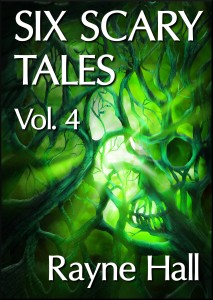
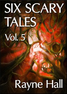
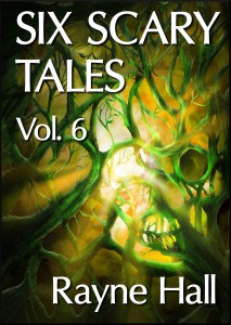
Today, I am delighted to do a cover reveal for the fantasy and horror fiction writer, Rayne Hall. With the release of the fourth Six Scary Tales volume, Rayne’s decided to re-release the previous volumes so that all the covers match. Plus, I can reveal the covers for the fifth and sixth volumes which haven’t yet been released either! Artist Erica Syverson has worked with Rayne in order to produce these covers; you can read cover reveal interviews with both Erica and Rayne later on in this post.
But, first, aren’t these covers stunning?


Cover Reveal Interview with Rayne Hall:
What made you want to have a new cover for the Six Scary Tales series?
The old cover was something I cobbled together from two stock photos, one of smoke and one of a skull, to represent the horror genre. Now the series has taken off, it deserves a special cover. The fourth volume is about to be published, so it’s the right time. I love it when an artist creates an original painting to go with my book. It’s a cross-fertilisation of two art forms, and that’s exciting.
How important do you think the book cover is in attracting potential readers?
Book covers serve to attract the readers’ attention and to rouse their interest. Nowadays, people buy more books online than in brick-and-mortar bookshops, so the cover needs to look attractive at thumbnail size.
What’s the most important ‘thing’ in a cover?
A good cover reflects the content. It promises the reader “This is what you’ll get if you buy this book.”
The cover of a short story collection needs to reflect not just one story, but all of them. In the case of the Six Scary Tales, the picture needed to fit the all the stories in all the books, even the ones not yet written. I asked Erica to create something that would convey the flavour of my horror fiction: not slash&gore type horror, but suspenseful, atmospheric, creepy tales. She came up with the idea of tree branches intertwined to form a skull.
What do you like most about this cover?
I think it conveys my brand of horror beautifully. It signals to potential readers that they’ll get atmospheric creepiness. The colours look stunning. Each version is monochrome, but has a distinct character.
Do you always commission artists to create your covers?
I design most of the covers myself, either with original art or with stock photos. Stock photos are quick to get and cheap, but they’re seldom exactly what I want, and they can be used by other people, so the same picture may grace several book covers.
When I commission an artist, I get exactly what I want. I’m involved in all stages of the process, from discussing the concept, seeing the first sketches, to the final version. I can request whatever I like, e.g. “Make the hero’s eyes darker and his shoulders broader… open two more buttons on his shirt.” It’s also thrilling to watch how an artist interprets my book visually. And nobody else can use the picture; it’s all mine.
Not all authors and publishers get involved in the process as much as I do. Many are content to just leave it to the artists, or even to buy ready-made covers.
With me, it’s different. I enjoy creating book covers digitally, and I understand design. After working in publishing for thirty years, I understand the marketing impact of book cover designs, and I want a cover that does my book justice and also sells. Often, I give detailed and precise instructions to the artists, because I know what I want. With Six Scary Tales, it was a bit different, because I had no clear concept in mind, only a desired effect, so Erica could get really creative.
When you’re writing the content of your books do you already have a particular image in mind for the cover?
With most books, I wait until the manuscript is complete before I think about the cover. The first decision is which artist to commission. Only when I’ve chosen the artist do I decide what exactly I want on the cover and write a detailed brief.
The Six Scary Tales cover was an unusual case, because the same picture will recur on all books of the series. The first twenty-four stories are already written, even published, while the stories for the future volumes are still unformed.
I chose Erica Syverson for this commission, because she has created several book covers for me before (Haunted: Ten Tales of Ghosts, Bites: Ten Tales of Vampires, Undead: Ten Tales of Zombies), and she has also collaborated on the cover for Storm Dancer. Erica is dependable and she has a knack for creepiness.
How long, on average, does it take to get a cover created, from start to finish?
Anything between twenty-four hours and three months, depending on the artist’s availability and my publishing schedule.
And now for the Cover Reveal Interview with Erica Syverson:
How do you go about creating a cover?
When I go about creating a cover- I first begin with very rough sketches and compositions. They give a basic gesture of what the final design will look like. Once the initial concept is okay-ed by the author, I start fleshing in the details with color and lighting. I like to keep in touch with the author throughout the process, to make sure to fix anything they would like changed along the way. That way the final design looks exactly the way they’d like it to be.
Do you allow the author(s) to have a large input in the design of a cover?
The author’s input is very important- most often, the author will pitch the initial idea, and with my artistic knowledge set I will bring their ideas together. I enjoy bringing to life exactly what the author has in mind if they have a specific vision for their cover.
Of course- some clients prefer to let the artist handle the entire design of the book- which leaves me more artistic wiggle room. If this is the case I suggest new ideas to the author which they might have not considered before.
Is the final version of the Six Scary Tales cover very different to your initial design?
The final cover for Six Scary Tales is very similar to its early concept- Rayne and I discussed possible ideas and she gave me a lot of artistic freedom with this cover- so I was able to pitch my own design to her. Its final design followed through rather strongly!
What’s your favourite part of designing covers?
That’s a difficult question! initial designing and rough painting of the covers- it’s raw and it’s messy and fun. Then refining and seeing the concept come to life is also fun, and finally, having the clients walk away feeling satisfied is another great reward. Altogether, it’s a rather rewarding process.
What made you want to start designing and creating covers?
When I first advertised for commissions, I had absolutely no idea that I’d begin illustrating books. I was approached by Rayne Hall- who commissioned me for my first professional commission- Bites: Ten Tales of Vampires. Since then, I’ve made numerous contacts and commissions for publications, and I’ve found it to be an extremely rewarding experience! I hope to work with authors time and time again.
———-
What do you think of these new covers? I love them–the unity between them is great! You can leave your replies below.

